

Table of Contents
So, you started a company or a business and it was a huge success. Awesome! Then you made the right decision to expand your business to the internet in order to enhance traffic, sales, and brand recognition. Great! The opportunities are nearly unlimited now that your business or company is represented online. The question is, has your website all the features of a responsive web design?
A strong online presence is an excellent method to highlight the key characteristics of your company and boost the effectiveness of your marketing approach. We live in a mobile and digital age, therefore having a website that works on any device, regardless of screen size, is a must to satisfy the expectations of your customers. The best method to do this is to create a responsive web design.
What Is a Responsive Web Design, and How Does It Work?
What exactly does that imply? The primary premise behind the term “responsive web design” is that there are so many terminologies for websites and how they interact with technology (mobile devices: cell phones, tablets, netbooks, etc.).
All webpages that are modified are dependent on the device accessing them and will be referred to as “responsive” for the sake of clarity. The method you employ to design your site is entirely up to you; this article is more concerned with why you want your website to be considered responsive rather than how you go about doing it. We no longer stop for anything, and a responsive website allows clients to interact with your company without having to sit in front of a personal computer.
A responsive website, from a marketing standpoint, can improve the success of your marketing strategy by allowing potential customers to contact you immediately. There is no putting off or trying to remember to “check out that site when we get home.” Customers can see your advertisement and go straight to your website. This is because mobile devices are frequently used in modern marketing to make advertisements more successful, a responsive web design expands your marketing alternatives.

You run the danger of your website not appearing properly if you don’t use a responsive design. Menus, alignments, or images may be distorted or proportioned wrongly, forcing your customer to scroll around for material, or making it eligible. You can be sure that everything will be set out clearly and that the most crucial information will be prominently shown if you use a responsive design.
Maintaining brand recognition is also easier with an adaptable website design. You can ensure that your site looks the same no matter when or where it is accessed by making it responsive. This is especially useful if you choose an adjustable layout, as you’ll have more flexibility over where text, banners, and images, are placed.
Frequently asked questions about responsive website design
How do responsive web designs function?
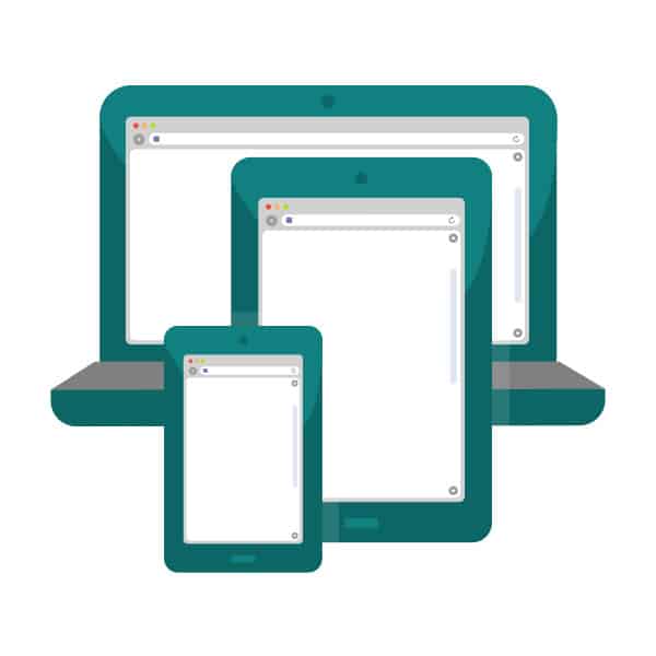
Any screen size and device, from the largest PCs to the smallest cellphones, can use a responsive website. Responsive websites examine the size of the device and modify themselves automatically to fit rather than generating various layouts to match different sizes and resolutions.
What does the term “responsive web design” mean?
An approach to creating web pages called responsive design uses flexible layouts, flexible images, and media queries in cascading style sheets. The objective of responsive design is to create web pages that recognize the size and orientation of the visitor’s screen and adjust the layout accordingly.
What are examples of responsive web design?
This very website, AfricanITNews.com and Host Advocate are examples of responsive website designs, that aim to give users the best possible smooth transition between their mobile and desktop editions. On both the desktop and mobile versions, all the content renders perfectly and no information is lost or hidden.
If you need a responsive website, you can contact them HERE!
Why is responsive web design necessary and what does it entail?
Your website’s content may flow smoothly across all screen sizes and resolutions with responsive design, and it will appear beautiful on all devices. Additionally, it eliminates the need to maintain separate websites for mobile and desktop users, saving you time, money, and effort.
What does HTML’s responsive design mean?
Utilizing HTML and CSS to have a website automatically resize itself is known as responsive web design. Making a website seem excellent across all platforms (desktops, tablets, and phones) is the goal of responsive web design.
What three components make up responsive web design?
The media query, the web browser, and the responsive web interface itself are the three primary parts of responsive web design.
What advantages does responsive web design have for your company?
Some of the benefits of responsive web design include:
- Use responsive site design to increase your income.
- Responsive web designs aid in improving search engine rankings for websites.
- Maintain visitor engagement to reduce bounce rates.
- Responsive designs aid in expanding your clientele.
- The use of responsive web design might help you save time and money.
What constitutes responsive design’s essential components?
- Image optimization.
- Coherence.
- Whitespace
- Congruence.
- Intelligent navigation.
Conclusion
As technology progresses, more possibilities for handheld devices become accessible. Since its first debut, the iPhone, for example, has gone through four distinct screen sizes and six different screen resolutions. A responsive website not only allows your clients to see your site at its finest as a reflection of your business, but it also eliminates the need to constantly construct new layouts to stay up with mobile device technology’s ever-changing technology.